How to Choose the Right Shade of Wellness-Studio White Paint for Your Walls

White walls are especially key to this aesthetic, IMO. When executed correctly, they can make an entire space feel brighter, more open, and more tranquil. But it's definitely possible to do them the wrong way, as I discovered at a house I lived in a few years ago. Initially, I was drawn in by the sharp contrast between the ultra-white walls and the dark hardwood floors, but once I moved in and had mirrors installed, I realized the shade of white was way too bright—like, it made me look as washed-out as a Victorian-era child with cholera.
So when I started thinking about painting my current kitchen cabinets to match my oat milk, I turned to Serena Mitnik-Miller and Mason St. Peter, co-founders of the General Store lifestyle boutiques in San Francisco and Los Angeles. As evidenced in their new book, Abode: Thoughtful Living With Less, clean white surfaces are an integral part of their design signature, along with natural materials, vintage furnishings, and hand-made curios.
"Serena's unofficial mantra is: The only option is white," the duo writes in Abode. "That's not to say we don't appreciate color...but we want to draw attention to the whole, not a part, and a cohesive neutral palette helps us achieve this." And while you might think this approach makes things easier, that's not exactly true. "Choosing the precise shade [of white paint] is a master skill in its own right," write Mitnik-Miller and St. Peter—and that's just step one.
Here, the designers share the dos and don'ts of choosing white paint colors for your space—because honestly, who doesn't want to feel like they're on a Tulum spa vacay, every day?
Do consider the type of surface you're painting
Getting that alabaster look isn't as simple as buying one can of paint and going to town with the roller. "We prefer to keep it monochrome, but we do use different finishes depending on the surface," says Mitnik-Miller. "There are paints for all different jobs. Wall and ceiling paint are different from paint for floors, bricks, blocks, or rocks."
In general, Mitnik-Miller and St. Peter opt for a flat finish for walls and a semigloss finish for textured surfaces like doors, cabinets, and trim. A satin or semigloss finish is also recommended for kitchens and bathrooms, as it can withstand a little scrubbing—you know, when you inevitably end up splattering some smoothie or mud mask on the walls.
Don't choose different white paint colors for different rooms or architectural elements
While Mitnik-Miller and St. Peter often use different paint finishes in different parts of a space, they generally stick with the same shade of white throughout. This isn't always the norm—some painters prefer to switch it up based on the light conditions in different rooms or the materials they're painting over—but the duo claim that by doing this, you lose that calming, monochromatic effect. Their favorite multipurpose white paint colors are Swiss Coffee by Behr (creamy white with a soft yellow undertone) and Super White by Benjamin Moore (described as a "brilliant, almost sparkling" shade.)
Do test the paint in your space
No matter which shade you're drawn to, it's bound to look a lot different in your home than it does in the hardware store. That's why Mitnik-Miller and St. Peter recommend testing it out on a sizable piece of the surface you want to paint—a few square feet, at least—and living with it for a few days, checking how it looks in different light conditions. "Understanding your lighting and exposure to sunlight can help increase your chance for success," says Mitnik-Miller. "Some whites can look green or blue or pink in certain lights—test areas first!" If you're deciding between a few different shades, the pair recommend swatching them side-by-side to compare.
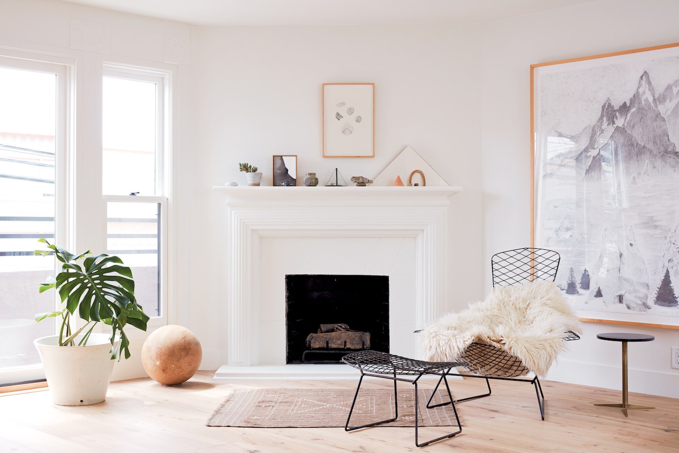
Don't be afraid of floor-to-ceiling white
For a supremely Zenned-out effect, Mitnik-Miller and St. Peter encourage you to look beyond the walls in your space and paint other architectural elements white as well—think floors, fireplaces, built-in cabinets, ceilings, the works. If you're an inexperienced painter and you want to go this route, however, they recommend getting professional help with it. After all, it's not as easy to reverse the effects of painting, say, your hardwood floors or brick fireplace as it would be to paint over a wall. And again, you'll want to seek out paint that's specifically designed for those types of surfaces, which is where expert guidance can be helpful.
Do prep your space thoroughly
A few more tricks of the trade, per Mitnik-Miller: Be sure you're prepared with all the essentials before you start—drop cloths for the floors, tape for edges, clean brushes for detail work and rollers for large areas, and wet washcloths for wiping up drips—and primer. "Not considering the surface that the paint is going to be applied to is the most common misstep in the process of paint application," she says. "Primer is key!" Choose a primer specific to the material you're painting over, and you'll have the best chance of your room turning out like all the ones you've favorited on Instagram.
Peel-and-stick wallpaper is another hot home trend—here are 9 designs to buy right now. Then, finish off your sanctuary with a few pieces from Ikea's new self-care collection.
Loading More Posts...


