The Psychological Reason Why the Color Green Is Trending in Home Design—And How To Embrace It
The color green is having a moment in home design likely due to its mood-boosting effect. Design experts share how to embrace this trend.

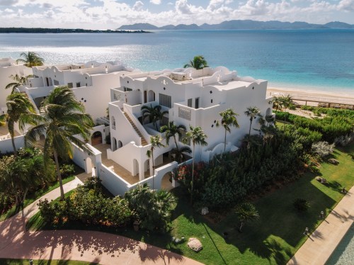
When the pandemic pushed many of us into more intimate relationships with our homes than we’d perhaps ever had, we sought out ways to make these spaces uplift and support us in return. If we couldn’t leave the house, the least we could do was transform it into a soothing sanctuary best fit to combat high levels of stress and uncertainty triggered by the pandemic itself. With this in mind, it makes sense that we soon saw an influx of wellness-boosting home tech; the rise of the at-home meditation corner; and so, so, so many houseplants. Last year, we spotted the seeds of this indoor-greenery revolution, and it’s since grown to epic proportions. Now, a new green trend is sprouting: the use of the color green throughout elements of home design.
Experts in This Article
Anastasia Casey is the founder and creative director at The Identité Collective, a team of 12 designers, writers & creators specializing in branding, web design, content creation, and Instagram management for interior designers. IDCO Studio is a boutique creative agency, crafting brands built around beautiful living.
Claire Marie Zinnecker is the founder of Claire Zinnecker Design, a boutique interior design group based in Austin, TX. Claire is a firm believer that every space tells a story. Her unique style paired with her passion for clean, affordable design has become her design aesthetic’s trademark.
Rachael Grochowski founded RHG A+D, a boutique, award-winning Architecture and Interiors firm, in Montclair, New Jersey in 2003. The firm works on commercial, residential, and retail projects within both regional and international markets. A desire to create spaces that connect with a client on a physical, experiential, and spiritual level are what drives Rachael and her team. RHG A+D approaches design with an understanding that it is more than just aesthetic and function; design is emotive and sensory as well as being physical.
environmental psychologist
Shawna Percival is the founder and creative director at Styleberry Creative Interiors. Her 10-year design career started with a Business, Art & Media degree, grew into the popular Styleberry Blog of the late 2000s, and became the flourishing design firm that Styleberry Creative is today.
Over the past few months, four major paint brands announced that some type of green would be its color of the year for 2022. Behr went with a light sea-glass green called Breezeway; PPG Paints chose a neutral gray-green called Olive Sprig; Benjamin Moore picked a soft sage green called October Mist; and Glidden chose a creamy plant-inspired green called Guacamole. It’s no coincidence that the names and descriptions of all these shades hint at something natural or organic. According to environmental psychologist Sally Augustin, PhD, principal at Design With Science, this influx of green likely stems from our deep-rooted connection to nature and its supportive qualities.
“We know that seeing green, leafy plants can bring down your stress levels, improve your mood, enhance your cognitive performance, and allow you to think more creatively,” says Dr. Augustin, whose work involves helping interior designers make choices based on their psychological and neuro-scientific implications (aka how certain designs and decor make a person feel within a space). Separately, several studies have also shown that the color green itself may have a positive effect on the psyche, whether by boosting levels of optimism in memory recall, increasing feelings of comfort and calm, or enhancing performance on creative tasks.
“It’s conjectured that we have such a positive response to green because eons ago, when we were around lots of green plants, it meant that life was generally good.” —Sally Augustin, PhD, environmental psychologist
Dr. Augustin posits that the mental impact of the color green (both naturally occurring and in decor) is tied to our evolutionary past. “It’s conjectured that we have such a positive response to green because eons ago, when we were around lots of green plants, it meant that life was generally good, there was something to eat and drink nearby, and you could let your mind wander freely toward things other than these basic necessities,” she says.
That mental lightness and positivity is likely a big reason why paint companies and designers alike are forecasting even more of the color green springing up in home design as we head into 2022. Even though we may not be subject to shelter-in-place directives anymore, “the pandemic has left us all needing a soothing change of scenery,” says designer Claire Zinnecker, adding that a soft green is not only calming for its reminiscence of nature, but it also keeps the design neutral and goes with almost anything.
How to use the color green in home design for the most soothing effect, according to design experts
Scan your natural light before selecting a green paint color.
If you’re working with limited natural light, consider going a few shades lighter on the green paint because it’ll inevitably look darker once it’s in place, says designer Anastasia Casey, founder and creative director at The Identité Collective. “And to get an accurate read on the color you’re choosing, view swatches on a vertical surface instead of flat on the counter because the light will reflect differently,” she says.
While you’re scanning your space, look out for any colors that are reflected upon it, perhaps from the color of a neighboring house. “If your light reads warmer, say orange or pink, you’ll want to counter that in the green color you select by opting for a cooler tone,” says Casey.
If in doubt, opt for a muted shade of green paint.
In general, lighter and less-saturated colors are more relaxing to view, says Dr. Augustin, who even suggests mixing one of the green paint colors of the year with a gallon of white paint to get a more soothing green tone. Not to mention, a lighter color on a wall can also make a space seem slightly larger, which is generally a good thing if you’re going to be spending a lot of time in it, she adds.
Get creative with green accents.
While most green shades offer the aforementioned positive effects, they’re not all created equally, says architect and designer Rachael Grochowski. “Some are more calming, others are more activating,” she says. To dip your toe into the green trend, try incorporating green with a single furniture piece or accent pillows mixed with beige and cream neutrals, she adds: “I like deep greens for millwork, green-blues for accent walls, and mint greens for throws, or a variety of soft green tones for a collection of vases, candlesticks, or bowls.”
Because of green’s big-time versatility, though, it’s tough to go wrong. “We use green in, no kidding, every single room we create,” says designer Shawna Percival, founder and creative director of Styleberry Creative Interiors. “We are seeing green being implemented into design in the form of cabinet color, upholstery, tile, and wall color.” While you can certainly pair varying shades of green together, Percival also loves the calming effect of a soft sage with complimentary pastels.
Oh hi! You look like someone who loves free workouts, discounts for cutting-edge wellness brands, and exclusive Well+Good content. Sign up for Well+, our online community of wellness insiders, and unlock your rewards instantly.
Sign Up for Our Daily Newsletter
Get all the latest in wellness, trends, food, fitness, beauty, and more delivered right to your inbox.
Got it, you've been added to our email list.